
I’m presenting a workflow for finishing maps in Inkscape at FOSS4G North America this year (2016). To really show the process effectively, I made a map and took screenshots along the way.
The Data
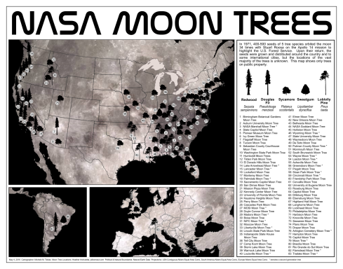
I decided to work with Moon Tree location data. It’s quirky and interesting… and given that this is a geek conference I figured the space reference would be appreciated. A few months ago I learned about Moon Trees watching an episode of Huell Howser on KVIE Public Television and then visited the one on the California State Capitol grounds. I later learned from my aunt that my grandfather was a part of the telemetry crew that retrieved the Apollo 14 mission that carried the seeds that would become the Moon Trees, so there’s something of a connection to this idea. Followers of my research also know that I’m a plant person, particularly plant geography. So this seemed like the perfect dataset. I was fortunate to find that Heather Archuletta had already digitized the locations of public trees and made them available in KML format.
Data Processing
The KML format is great for some applications (particularly Google maps, for which it was designed) but it poses some challenges. I spent several hours… maybe more than I want to admit… formatting the .dbf to make the shapefile more useful for my purposes. I created columns and standardized the content. The map does not present all the data available (um… duh.). It was challenge enough getting all this onto one page.
Yes, Inkscape is Necessary
You can’t make this map in QGIS completely. I mean, normally you can make some fantastic maps in QGIS, but this one is actually not possible. Right now, QGIS can’t handle having map frames with different projections. I tried, but I found that even when the map composer looked right, the export in all three export options changed the projection and center of each frame to match that of the last active frame. So I ended up with a layout with three zoom levels centered on Brazil… interesting, but not what I had in mind. So I exported an .svg file three times from the map composer – one for each map frame – and put them together in Inkscape.
Sneaky Cartography
One of the methods I often use in my maps is to create subtle blurred halos behind text or icons that might otherwise get lost on a busy background. I don’t like when the viewer sees the halos (maybe it’s from teaching ArcMap far too many years at universities). It’s not quite a pet peeve, but I think there’s often better ways to handle busy backgrounds and readability. My blog, my soapbox. Can you spot them? There are a couple in the map and in the final slide of the pitch video. It doesn’t look like much, but I promise the text is easier to read.
The texture on the continents is the moon. I clipped a photo of the moon using the continent outlines. I liked the idea of trees on the moon.
Icons
The icons are special to me. I’ve been really wanting to make a map using images from Phylopic and I thought this was the perfect opportunity… but… but… no one had uploaded outlines for any of the species I needed. So I made them and uploaded them. So if you want an .svg of these, help yourself. If, however, you need dinosaurs, they’ve got you covered.
Watch it happen:
My pitch video captures the process from start to finish:
Want more open source cartography?
Come to FOSS4G North America and see my and several other talks focused on cartography. I’ll cover methods and tools in Inkscape common for cartography.

February 4th, 2021 at 12:32 am
[…] list, and there is also an article and photographs from our friends at National Geographic. Artist Michele M. Tobias created the map […]
February 5th, 2021 at 9:11 am
[…] an article and photographs from our friends at National Geographic. UC Davis data scientist Michele M. Tobias created the map above. You can also learn more about the trees from our colleagues at Marshall […]
February 5th, 2021 at 9:42 am
[…] an article and photographs from our friends at National Geographic. UC Davis data scientist Michele M. Tobias created the map above. You can also learn more about the trees from our colleagues at Marshall […]
February 5th, 2021 at 10:03 am
[…] also an article and photographs from our friends at National Geographic. UC Davis data scientist Michele M. Tobias created the map above. You can also learn more about the trees from our colleagues at Marshall […]
February 8th, 2021 at 7:46 am
Hello. I worked for NASA for 35 years at the Johnson Space Center and ran across the existence of Moon Trees after I retired. I inquired a little and found out JSC did not have one which really surprised me. So after a little more work with the locals here and Rosemary Roosa we now have a Moon Tree on campus near Building 1! It was planted in 2016. I have tried to get it on the “official” list but still have not been successful. Such a fun project particularly for those that were planted soon after the return of Apollo 14 that can “measure” how long ago it was…
February 8th, 2021 at 9:38 am
Sounds like your tree was planted right about the time I was making this map. Maybe at some point, I can put the data up where people can add trees to the dataset. I don’t have the official record, but at least they could go somewhere.